Le designer qui a placé le trophée directement sur le logo
Le logo de la Coupe du Monde 2026 est l’identité visuelle la plus littérale de l’histoire du tournoi, une décision de design si directe qu’elle est devenue controversée précisément à cause de son refus d’être intéressante. Le logo représente le trophée réel de la Coupe du Monde — p
Publié : June 6, 2026
# The Designer Who Put the Trophy Directly on the Logo, and the Polarized Reactions
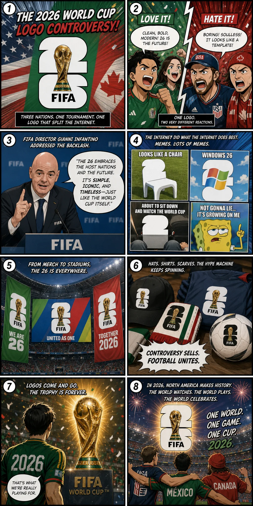
The official logo for the 2026 World Cup is the boldest one in history. FIFA didn't use abstract lines. They didn't use metaphorical graphics. They didn't use any design language that requires you to stare at it for thirty seconds to understand. They simply placed a real photo of the World Cup trophy—that golden, arm-reaching Victory figure—and superimposed the number "26" behind it. That's it. Trophy. 26. Nothing else.
This logo sparked polarized reactions in the design community. One camp said it was too lazy—"You can't even be bothered to draw it? Just using a photo? This isn't design, it's a screenshot." The other camp called it genius—"The ultimate goal of the World Cup is that trophy. Why hide it behind a bunch of abstract shapes? After thirty years of watching the World Cup, what's the first thing you want to see? That trophy." FIFA's design director explained their thinking in an interview: "We wanted to remove all the intermediate steps. Fans don't need to be convinced that the World Cup matters. They just need to see that trophy. That trophy itself is the most powerful visual symbol in the world. Our job isn't to design a new symbol—it's to put that existing symbol where everyone can see it."
Public reaction was also divided. People on social media made memes—taking photos of everyday objects and adding numbers, calling it the "World Cup logo style": a Starbucks coffee with "26" behind it, a cat with "26" behind it, a half-eaten pizza with "26" behind it. FIFA's official account even reposted some of those memes—a sign of confidence from an organization that knows it did something right. When you have the guts to use a photo of a trophy as your logo, you're probably not afraid of being turned into a meme either.
But seriously—when you walk into a World Cup stadium and see that logo hanging on the outer wall, printed on tickets, embroidered on jersey patches, you won't think about memes. You'll only think about one thing: that trophy. That match. That summer you've waited four years for. The most honest part of that logo isn't its design. It's the message it doesn't say out loud but everyone understands: "What are we here to do? Lift this thing." That's why—whether you like its design or not—you'll remember it.